Data sample modeling
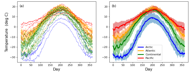
Consider the Canadian temperature dataset in the figure below. These data are from Ramsay & Silverman (2005) and are available for download here:
(Source code, png, hires.png, pdf)

The first step of power analysis is to create a model the data that can be used to generate real numerical data samples. Later those data samples will be iteratively generated over a large number of iterations in order to numerically accumulate probability distributions associated with the model.
In power1d there are four steps to creating a data sample model:
Create baseline geometry.
Create signal geometry.
Create a noise model.
Combine 1–3 in a DataSample model.
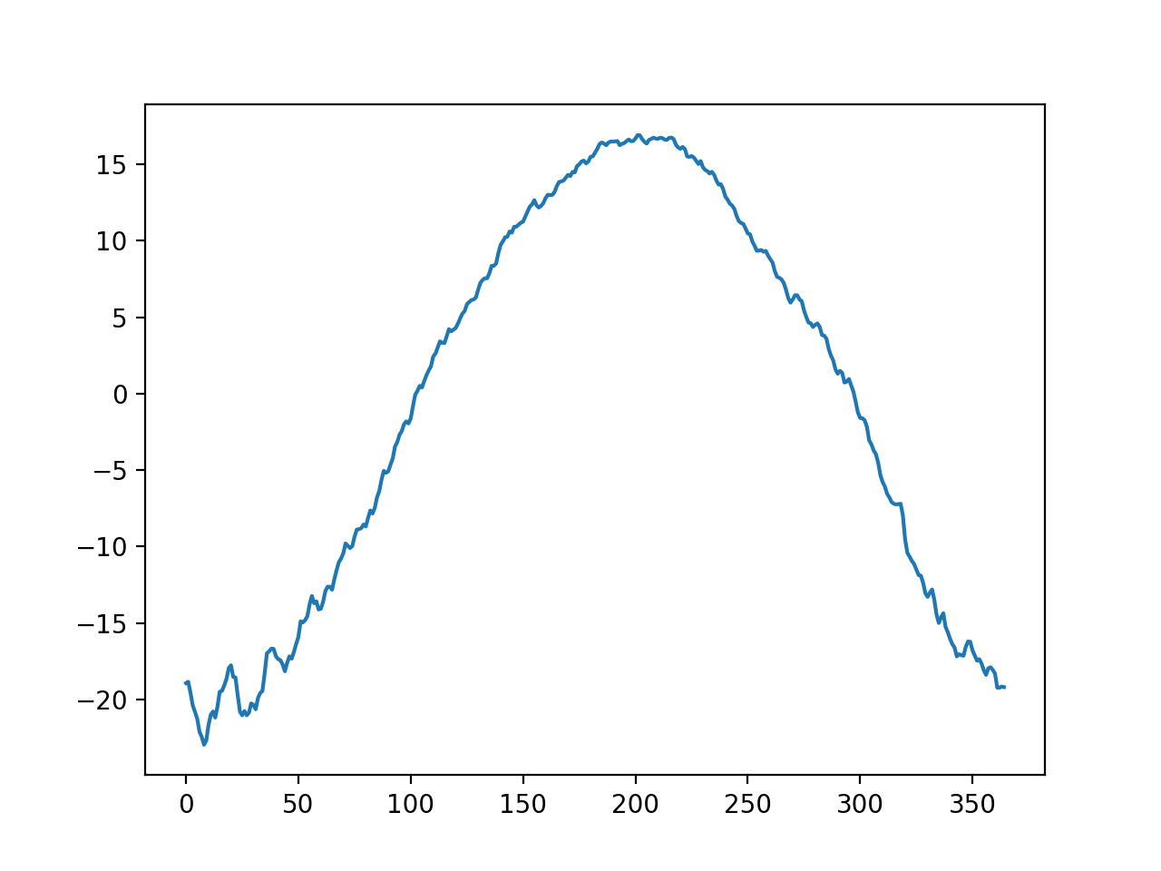
The first step is to create “baseline” one-dimensional (1D) geometry. If one has experimental data like those depicted above, it is easy to generate that baseline as a power1d.geom.Continuum1D as follows:
import power1d

data     = power1d.data.weather()  # load data
y        = data['Continental']     # extract one region
m        = y.mean( axis=0 )        # mean continuum

baseline = power1d.geom.Continuum1D( m )
baseline.plot()
(Source code, png, hires.png, pdf)
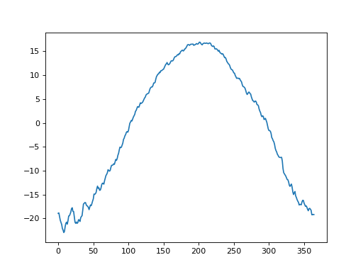
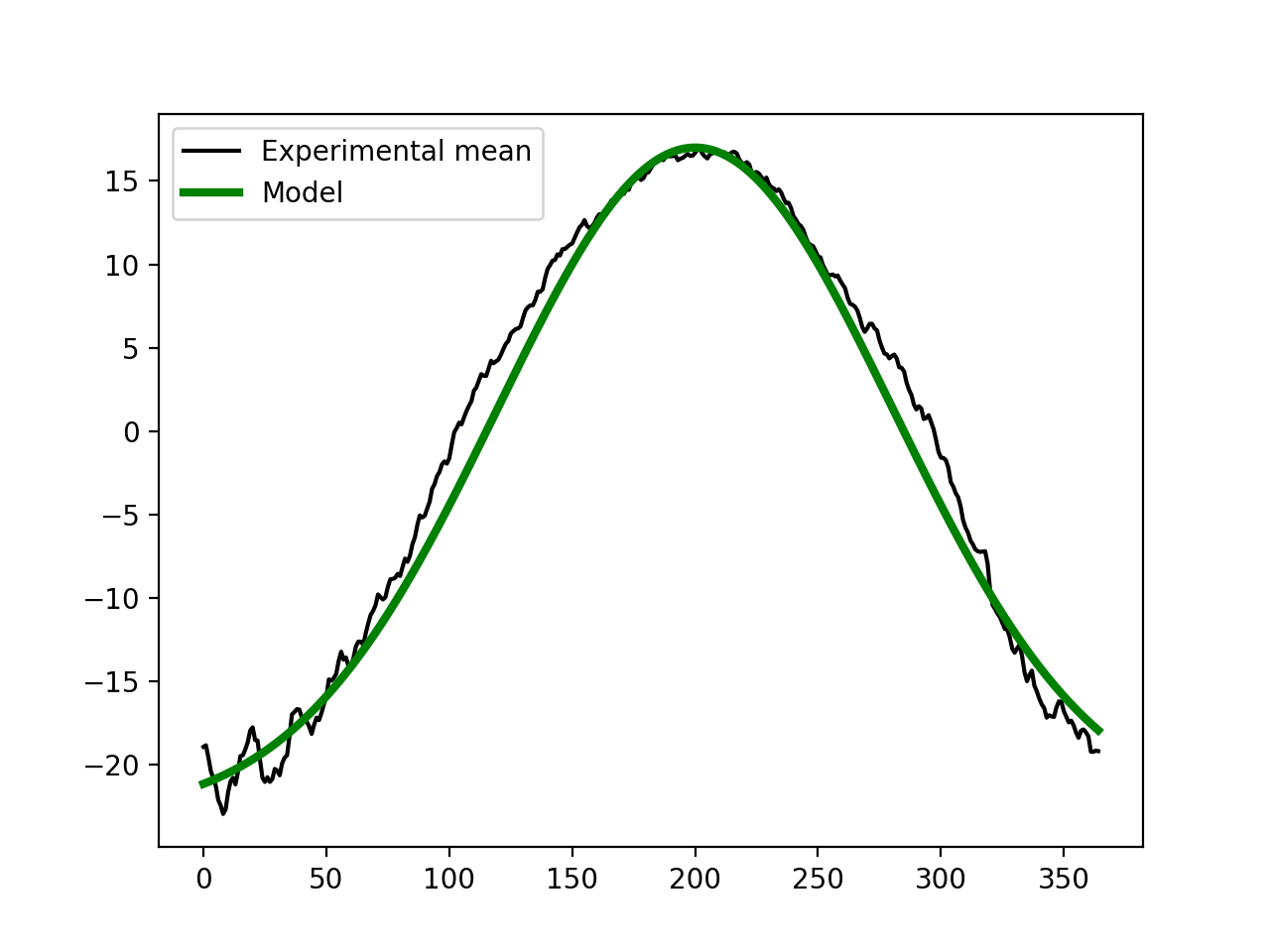
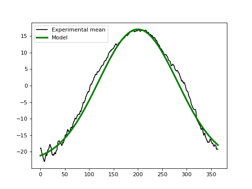
If we didn’t have experimental data we could approximate the baseline using the geometric models in power1d.geom. In this case one possibility for modeling the baseline is to subtract a Constant value from a GaussianPulse as indicated below. This appears to create a reasonable approximation to the experimental data.
import matplotlib.pyplot as plt
import power1d

data     = power1d.data.weather()  # load data
y        = data['Continental']     # extract one region
m        = y.mean( axis=0 )        # mean continuum

# approximate the experimental value using a Gaussian pulse:
Q        = 365  # continuum size
g0       = power1d.geom.GaussianPulse( Q , q=200 , fwhm=190 , amp=40 )
g1       = power1d.geom.Constant( Q , amp=23 )
baseline = g0 - g1  # subtract the geometries

ax       = plt.axes()
ax.plot( m , label='Experimental mean', color='k')
baseline.plot( ax=ax, color='g', linewidth=3, label='Model' )
ax.legend()
(Source code, png, hires.png, pdf)
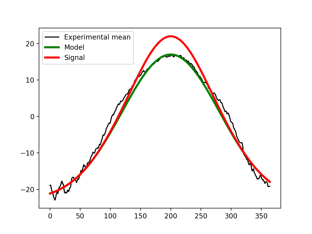
The second step is to create a signal that we wish to detect experimentally. Let’s say that we hope to detect a broad increase in temperature over the summer months with a maximum temperature increase of 5 deg. That could be modeled as a second Gaussian pulse like this:
import matplotlib.pyplot as plt
import power1d

data     = power1d.data.weather()  # load data
y        = data['Continental']     # extract one region
m        = y.mean( axis=0 )        # mean continuum

# approximate the experimental value using a Gaussian pulse:
Q        = 365  # continuum size
g0       = power1d.geom.GaussianPulse( Q , q=200 , fwhm=190 , amp=40 )
g1       = power1d.geom.Constant( Q , amp=23 )
baseline = g0 - g1  # subtract the geometries

# add a signal:
signal   = power1d.geom.GaussianPulse( Q , q=200 , fwhm=100 , amp=5 )

ax       = plt.axes()
ax.plot( m , label='Experimental mean', color='k')
baseline.plot( ax=ax, color='g', linewidth=3, label='Model' )
(baseline + signal).plot( ax=ax, color='r', linewidth=3, label='Signal' )
ax.legend()
(Source code, png, hires.png, pdf)
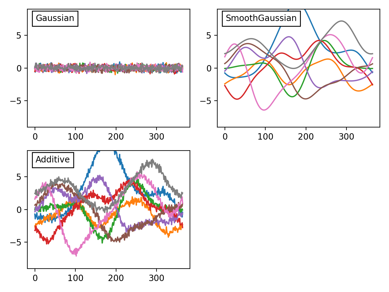
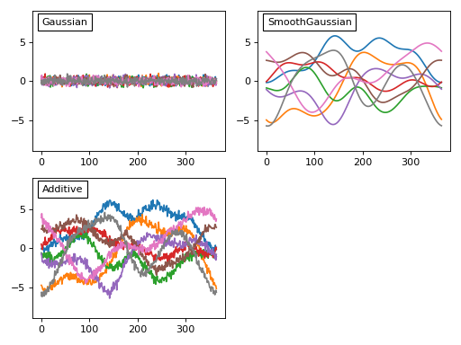
The third step is to create a model of the noise we expect to observe experimentally. From the weather data above we can see at least two types of noise: a high-frequency day-to-day noise and lower-frequency noise across the different 1D observations. In power1d a variety of noise models are available to model theses processes. Here let’s model the noise as a combination of uncorrelated Gaussian noise and SmoothGaussian noise:
import matplotlib.pyplot as plt
import power1d

J        = 8    # sample size
Q        = 365  # continuum size
noise0   = power1d.noise.Gaussian( J , Q , mu = 0 , sigma = 0.3 )
noise1   = power1d.noise.SmoothGaussian( J , Q , mu = 0 , sigma = 3 , fwhm = 70 )
noise    = power1d.noise.Additive( noise0 , noise1 )

fig,axs  = plt.subplots(2, 2, tight_layout=True)
axs[1,1].set_visible( False )

# plot noise objects:
noise0.plot( ax=axs[0,0] )
noise1.plot( ax=axs[0,1] )
noise.plot( ax=axs[1,0] )
plt.setp(axs, ylim=(-9, 9))

# add panel labels:
labels   = 'Gaussian', 'SmoothGaussian', 'Additive'
for ax,s in zip( axs.ravel() , labels ):
        ax.text(0.05, 0.9, s, transform=ax.transAxes, bbox=dict(facecolor='w'))
(Source code, png, hires.png, pdf)
Before we add that noise to our model let’s consider these noise models briefly. Each noise model has an attribute value which contains a (J x Q) array representing the current state of the random noise. New random noise can be generated using the random method, and the noise values can be replicated using NumPy’s np.random.seed function as follows:
import numpy as np
import matplotlib.pyplot as plt
import power1d

J = 3
Q = 5

fig,axs  = plt.subplots(2, 2, tight_layout=True)
axs[1,1].set_visible(False)

# (a) generate noise object:
np.random.seed(12345)
noise    = power1d.noise.Gaussian(J, Q, mu=0, sigma=1)
noise.plot( ax=axs[0,0] )

# (b) create new random data:
noise.random()
noise.plot( ax=axs[0,1] )

# (c) reset noise to its original state:
np.random.seed(12345)
noise.random()
noise.plot( ax=axs[1,0] )

# add panel labels:
labels   = '(a)  Original noise', '(b)  New noise', '(c)  Reset using np.random.seed'
for ax,s in zip( axs.ravel() , labels ):
        ax.text(0.05, 0.9, s, transform=ax.transAxes, bbox=dict(facecolor='w'))
(Source code, png, hires.png, pdf)
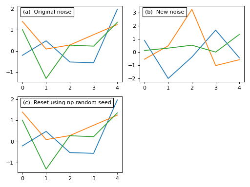
This noise control is identical for all types of noise models including compound types like the Additive model above.
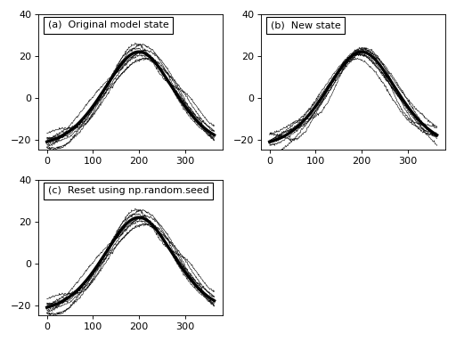
The fourth and final step is to combine our baseline, signal and noise objects into a DataSample object like this:
import numpy as np
import matplotlib.pyplot as plt
import power1d

J        = 8    # sample size
Q        = 365  # continuum size

# construct baseline geometry:
g0       = power1d.geom.GaussianPulse( Q , q=200 , fwhm=190 , amp=40 )
g1       = power1d.geom.Constant( Q , amp=23 )
baseline = g0 - g1  # subtract the geometries

# construct signal geometry:
signal   = power1d.geom.GaussianPulse( Q , q=200 , fwhm=100 , amp=5 )

# construct noise model:
noise0   = power1d.noise.Gaussian( J , Q , mu = 0 , sigma = 0.3 )
noise1   = power1d.noise.SmoothGaussian( J , Q , mu = 0 , sigma = 3 , fwhm = 70 )
noise    = power1d.noise.Additive( noise0 , noise1 )

# create data sample model:
model    = power1d.models.DataSample( baseline, signal, noise, J=J )

# visualize
fig,axs  = plt.subplots(2, 2, tight_layout=True)
axs[1,1].set_visible( False )

np.random.seed(12345)
model.random()
model.plot( ax=axs[0,0] )

model.random()
model.plot( ax=axs[0,1] )

np.random.seed(12345)
model.random()
model.plot( ax=axs[1,0] )

plt.setp(axs, ylim=(-25, 40))

# add panel labels:
labels   = '(a)  Original model state', '(b)  New state', '(c)  Reset using np.random.seed'
for ax,s in zip( axs.ravel() , labels ):
        ax.text(0.05, 0.9, s, transform=ax.transAxes, bbox=dict(facecolor='w'))
(Source code, png, hires.png, pdf)

In the figure above we see that, like the noise models, we can generate new data sample models using the random method and we can control the model’s random state using np.random.seed.
This instantaneous state of a DataModel represents the type of data we expect to observe in a single experiment if the baseline, signal and noise models are all accurate. If they are accurate we can numerically generate a large number of experimental datasets as if we had conducted a large number of experiments. Moreover, and most importantly, we can compare one model to another. Specifically, by comparing a model with no (or Null) signal to one with a modeled (non-null) signal we can calculate the power with which we will be able to detect that signal given our noise model.
This type of power analyis is described in the next section.